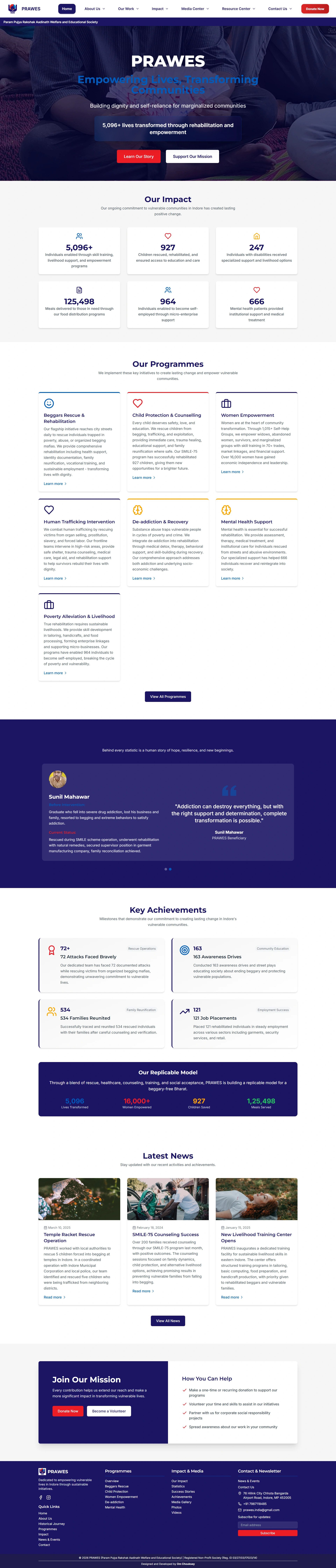
NGO PRAWES Website
Empowering Lives, Transforming Communities
Role
UI/UX Designer & Frontend Developer
Timeline
3 months
Tools
Figma, React, Tailwind CSS, Design Systems
Defining the Brand DNA & Design System
To ensure scalability and consistency across the platform, I approached the project by defining a core Brand DNA. The organization already possessed a foundational logo; rather than reinventing their visual identity, my approach was to carefully extract their existing brand colors and decode their natural roles to build a robust design system that truly represents NGO PRAWES's mission.
Color Palette: I extracted the primary Royal Blue (#1b1464) from their identity, assigning it to convey institutional stability and trust. The vibrant Sky Blue (#0ea5e9) was decoded as a secondary accent for approachability, while the high-contrast Red (#dc2626) was strategically carried forward to drive critical calls-to-action, such as donations. Pure White (#ffffff) was utilized as the canvas to provide breathing room and elevate the content.
Typography: For the typographic hierarchy, I paired Montserrat for headings with Inter for body copy. Montserrat brings a geometric, authoritative clarity to the overarching mission statements, while Inter guarantees pristine legibility for long-form impact reports across all devices.
Colors
Fonts
Tagline
Empowering Lives, Transforming Communities
Brand values
Component Architecture & Layout Strategy
The layout strategy was designed around the organization's core tagline: "Empowering Lives, Transforming Communities". Every section on the homepage serves a distinct psychological purpose. Following the hero section, the architecture introduces distinct, modular cards to break down complex organizational goals (e.g., Education, Healthcare, Empowerment) into digestible, interactive segments. The generous padding and strategic use of negative space allow the high-fidelity imagery to stand out without overwhelming the user.
Outcome & Personal Growth
By marrying a structured design system with empathetic UX, the PRAWES platform transformed into a modern, trustworthy digital entity. Implementing this with Tailwind CSS allowed me to bring static designs to life with subtle micro-interactions like slide-ups and fade-ins. The organization reported a significant increase in user engagement and commended the design for capturing their core ethos. Successfully delivering a professional-grade platform as a learner, and earning a formal Letter of Recommendation from the board, proved to be a definitive milestone in my product design journey.
“This project proved that a structured, professional approach to Brand DNA can create a massive real-world impact for an organization.”